
The worldview exists in many different forms and shades. Science proves that the human mood is easily affected by the surrounding things, and in that, color plays a quite obvious role that perhaps many people do not realize its impact. That is why we need to focus on the design of the layout, the ratio of colors in harmony in the interior spaces.
Different colors bring different emotions. In interior design, colors express personality and personal preferences, in addition, color trends are also influenced by culture or contemporary trends. If pink brings warmth to the bedroom, red or lemon yellow can increase appetite for members in the dining room. Blue tones in the living room create relaxation and friendliness for the viewer. White in the bathroom not only helps to increase cleanliness but also has the ability to expand the area and comfort.
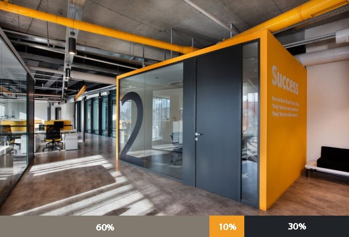
In an interior space layout, the main color will usually occupy 60% of the overall area, the decorative color only accounts for 30% to highlight the main color and the remaining 10% is the color used as accents to highlight the main color. creating diversity in the overall layout.

This rule can be easily applied to almost any space and it creates a sense of balance for the viewer. Here are some suggestions for some spaces designed according to the above rule.

The main color is usually neutral colors such as white, gray, gray, brown, cream…, secondary colors are usually other neutral colors or “pseudo-neutral” colors such as green, blue, yellow, etc. … complement the dominant color, or contrast the accent color.


The 60-30-10 rule is a basic and perfect color scheme. However, in practice, we should not always apply this rule rigidly and lose creativity and original ideas. If you want a spatial layout with more than three colors, you can adjust the formula relatively.
Just make sure that the dominant color ratio is the most, the accent color ratio is the least. Besides, we can create the fourth, fifth, … by dividing the primary – secondary or adding light – dark shadows to that color.


For spaces that need a striking impression, instead of using a gentle, neutral main color, we can break the way with vibrant colors.


Finally, to achieve the best effect when applying the 60-30-10 color scheme, we need to add color harmony. To get this, we can refer to the color wheel with the rule: color triangle, color quadrilateral, complementary symmetry, etc.
